Using fonts in an appealing way is an important part of branding. The way you use fonts can really make your product covers pop, create a great aesthetic for your social media feed, and give your TpT store a branded look.
Keep reading for quick tips on what you can do to up your font game quickly and easily! All of the tips for using fonts are for PowerPoint. Don’t forget to download this FREE Fonts Styling Guide I’ve made for you! Keep it handy, I walk you through step-by-step how to do each of the font effects in this blog post! Grab it HERE!
1: Using an Offset Outline With Your Fonts
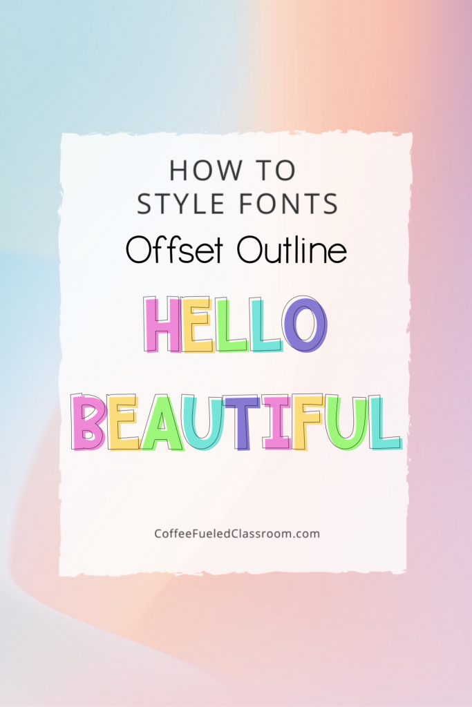
Use awesome fonts you already own for this offset outline effect. In Powerpoint, type the words in a chunky lettering. Copy and paste the text box. Highlight the new text you’ve just made. Right click and select format text – color fill = none, outline = yes. Then, put the outlined text over the solid colored text. Use the arrow keys to move this text box over and up a bit to use your font to make an offset effect.
2: Using Fonts With a Dramatic Drop Shadow
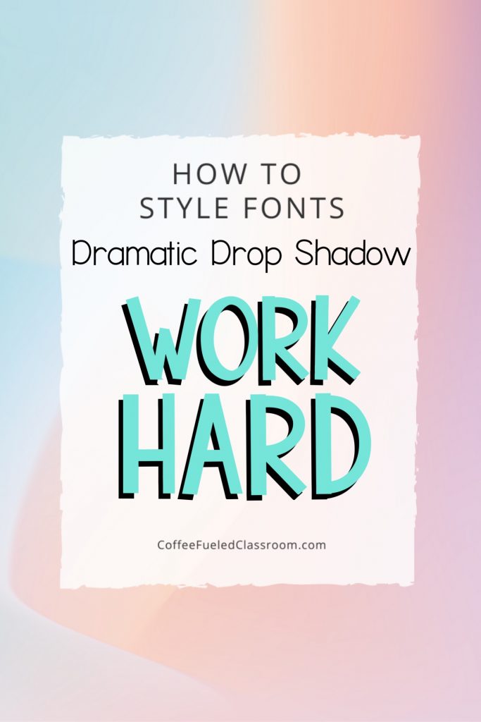
Using different fonts you already own you can create a dramatic drop shadow effect. In PowerPoint, type the words in a chunky lettering, use dark color. Copy and paste the text box. Next, change the color of the letters in your new text box to the main color you want to use. Overlay the text box so the fonts line up. Then, use your arrow keys to move the top text up and over just a bit to create a dramatic drop shadow below.
3: Using a Boxed Background Highlight
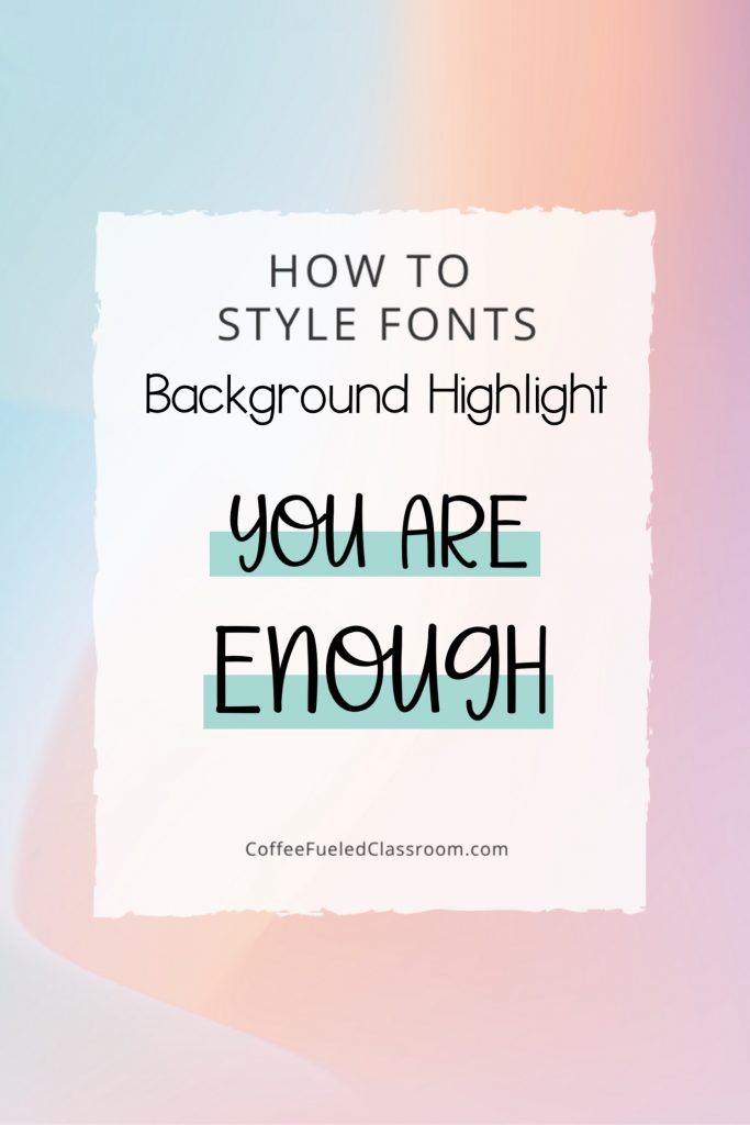
Using fonts on websites and using them on branding, the boxed background highlight effect is very on-trend right now. I love using this font effect on Pinterest and my lettering over my blog photos. In PowerPoint, use the shape tool to create a long, skinny rectangle. I like to set the transparency from 50-80% so the color of the box is not so bold. Then, use a dark color and use a bold, thin font to type your message! Adjust the size of the box as needed.
4: Use Font Pairing
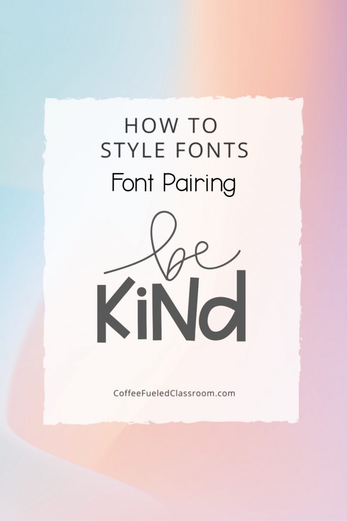
Using different fonts together is what font pairing is all about. Have you heard the saying opposites attract? When you use font pairing you create a contrast but in a complementary way. To use font pairing like a pro mix two fonts like a chunky bold font with a thin cursive font. Don’t be afraid to have letters in the words touch and overlap.
Click here to download a quick reference guide for font styling. I’ll also send you some more email freebies full of tips and tricks for Teacher-Authors.
Remember: Be mindful of who your audience is when choosing a font style. If you are creating an eye-catching cover or making a pin for Pinterest the fonts you use will be different than the ones you would use when creating a resource that a child will be consuming!
Want a closer look at how I use PowerPoint to create a PDF resource? Don’t miss this free training I have posted! It’s an over the shoulder look at me creating a resource from start to finish!
You may also like to check out tips on how to choose a name for your TpT store and Teacher-Author brand!


